Chapter 7 Visualization (Intro)
7.1 Introduction
library(tidyverse)
library(ggplot2)
library(medicaldata)
Blood storage dataset description
[A retrospective cohort study of] 316 men who had undergone radical prostatectomy and recieved tranfusion during or within 30 days of the surgical prodedure and had available PSA follow-up data. The outcome [of interest] was time to biochemical cancer recurrence. Study evaluated the association between red blood cells storage duration and biochemical prostate cancer recurrence after radical prostatectomy. Specifically, tested was the hypothesis that perioperative transfution of allogenetic RBCs stored for a prolonged period is associated with earlier biochemical recurrence of prostate cancer after prostatectomy.
blood <- medicaldata::blood_storage
head(blood) # use head to look at the first 6 rows
RBC.Age.Group Median.RBC.Age Age AA FamHx PVol TVol T.Stage bGS BN+
1 3 25 72.1 0 0 54.0 3 1 3 0
2 3 25 73.6 0 0 43.2 3 2 2 0
3 3 25 67.5 0 0 102.7 1 1 3 0
4 2 15 65.8 0 0 46.0 1 1 1 0
5 2 15 63.2 0 0 60.0 2 1 2 0
6 3 25 65.4 0 0 45.9 2 1 1 0
OrganConfined PreopPSA PreopTherapy Units sGS AnyAdjTherapy AdjRadTherapy
1 0 14.08 1 6 1 0 0
2 1 10.50 0 2 3 0 0
3 1 6.98 1 1 1 0 0
4 1 4.40 0 2 3 0 0
5 1 21.40 0 3 3 0 0
6 0 5.10 0 1 3 0 0
Recurrence Censor TimeToRecurrence
1 1 0 2.67
2 1 0 47.63
3 0 1 14.10
4 0 1 59.47
5 0 1 1.23
6 0 1 74.70class(blood)[1] "data.frame"# get just the column names for a dataset
names(blood) [1] "RBC.Age.Group" "Median.RBC.Age" "Age" "AA"
[5] "FamHx" "PVol" "TVol" "T.Stage"
[9] "bGS" "BN+" "OrganConfined" "PreopPSA"
[13] "PreopTherapy" "Units" "sGS" "AnyAdjTherapy"
[17] "AdjRadTherapy" "Recurrence" "Censor" "TimeToRecurrence"7.2 Data Types
While exploring a dataset, you want to know what each variable’s role in the analysis will be.
- What is the variable (i.e., column) of interest?
- response, dependent, y, outcome
- which are your predictor variables?
- predictor, independent variable, x
For each variable, you want to know what possible values it can take on.
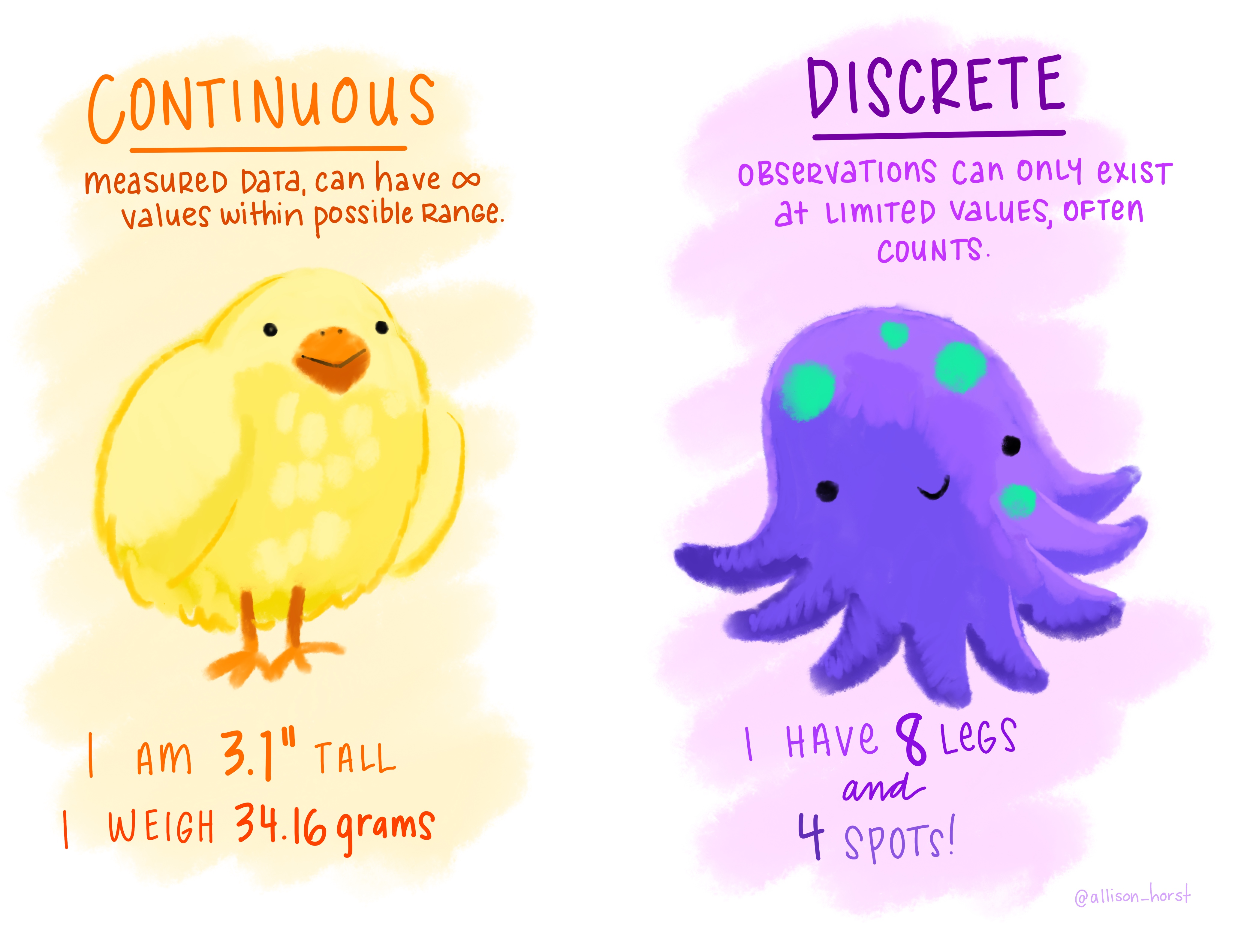
Figure 0.5: “Continuous Discrete” by Allison Horst.
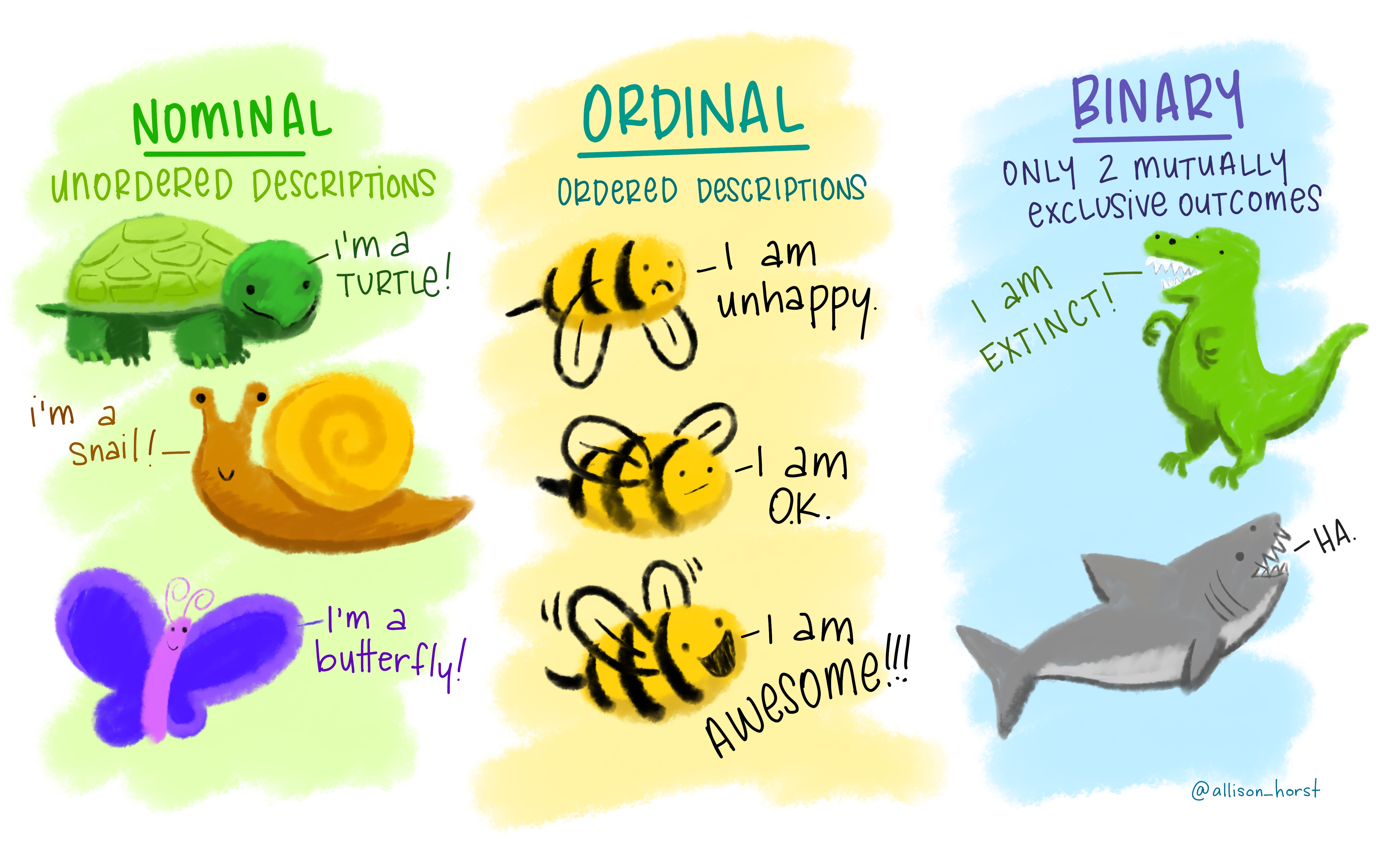
Figure 0.6: “Nominal Ordinal Binary” by Allison Horst.
The type of information a variable holds will dictate the summary statistics you can make, the visualizations you can create, and the models you can fit.
Ordinal and discrete variables should be converted into factor variables in R.
A factor is R’s way of naming a categorical variable.
This is different from a character string, e.g., a person’s name.
recurrence_freq <- blood %>%
  group_by(Recurrence) %>%
  summarize(count = n())
recurrence_freq
# A tibble: 2 × 2
Recurrence count
<dbl> <int>
1 0 262
2 1 547.3 Grammar of Graphics
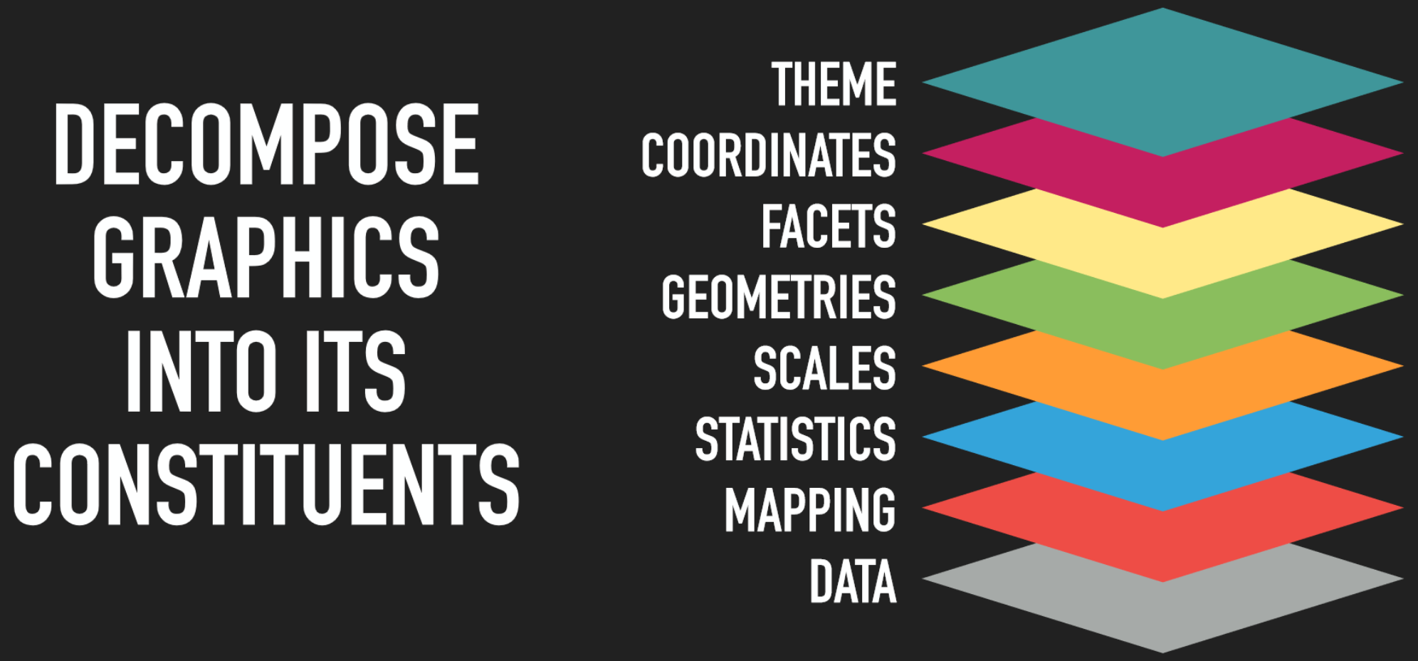
Figure 0.8: The idea behind the grammar of graphics is to decompose graphics into its constitudent layers: data, mapping, statistics, scales, geometries, facets, coordinates, and theme. by Thomas Lin Pedersen.
7.4 Data + geometries
# add a data layer
ggplot(data = blood)
# add a data later with an asthetic mapping
ggplot(data = blood, mapping = aes(x = Recurrence))
# add a geometry layer
# by default the stat layer for geom_bar will count values
ggplot(data = blood, mapping = aes(x = Recurrence)) + geom_bar()
If we have a pre-calculated set of values, we want to tell geom_bar to use the "identity" statistic.
recurrence_freq# A tibble: 2 × 2
Recurrence count
<dbl> <int>
1 0 262
2 1 54ggplot(data = recurrence_freq, mapping = aes(x = Recurrence, y = count)) +
geom_bar(stat = "identity")
Something to think about: we have highly unbalanced classes. This might be something to think about when you fit models and only look at blind performance metrics
100 patients, 99 healthy, 1 sick. If my model classifies healthy every time. It’s still 99% correct.
7.4.1 Layer values
If a value does not exist in a particular layer, ggplot will try to use data from the previous layer
# everything in the base layer
ggplot(data = recurrence_freq, mapping = aes(x = Recurrence, y = count)) +
  geom_bar(stat = "identity")
# move astetic mapping to geom layer
ggplot(data = recurrence_freq) +
  geom_bar(mapping = aes(x = Recurrence, y = count), stat = "identity")
# move data to geom layer
ggplot() +
  geom_bar(data = recurrence_freq, mapping = aes(x = Recurrence, y = count), stat = "identity")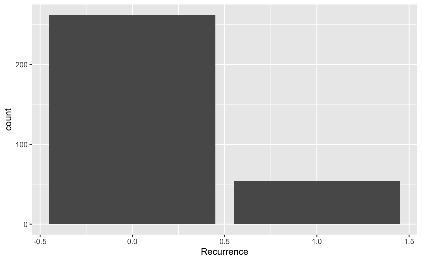
This means we can add more layers with different data sets if we want to.
7.5 Geometries
7.5.1 Univariate
7.5.1.1 Continuous
ggplot(blood, aes(x = Age)) + geom_histogram()`stat_bin()` using `bins = 30`. Pick better value with `binwidth`.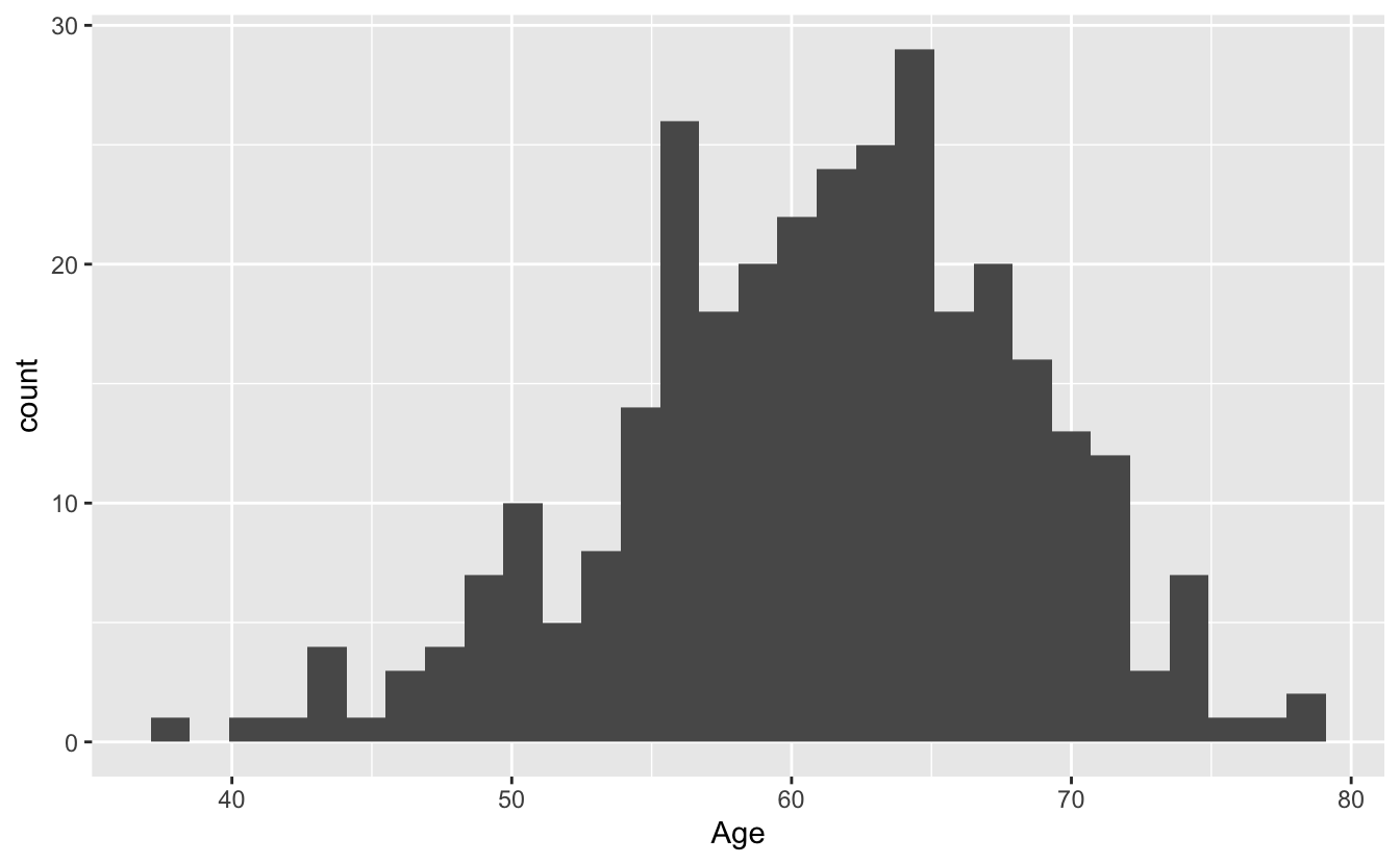
ggplot(blood, aes(x = Age)) + geom_histogram(bins = 10)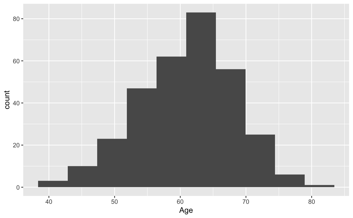
7.5.2 Bivariate
The TVol column represents the Tumor volume as an ordinal variable
- 1 = Low
- 2 = Medium
- 3 = Extensive
However, the way it is encoded in the dataset is as a (discrete) numeric variable,
even though it actually represents a categorical variable.
To convert the numeric column (or any column) into a categorical factor we can use the as.factor function.
# Does not show TVol properly
ggplot(blood) + geom_boxplot(aes(x = TVol, y = Age))
Warning: Continuous x aesthetic -- did you forget aes(group=...)?Warning: Removed 6 rows containing missing values (stat_boxplot).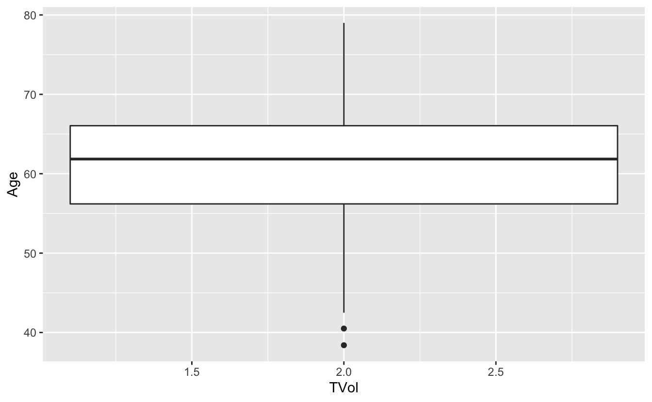
# please a box plot for each value of TVol as a factor
ggplot(blood) + geom_boxplot(aes(x = as.factor(TVol), y = Age))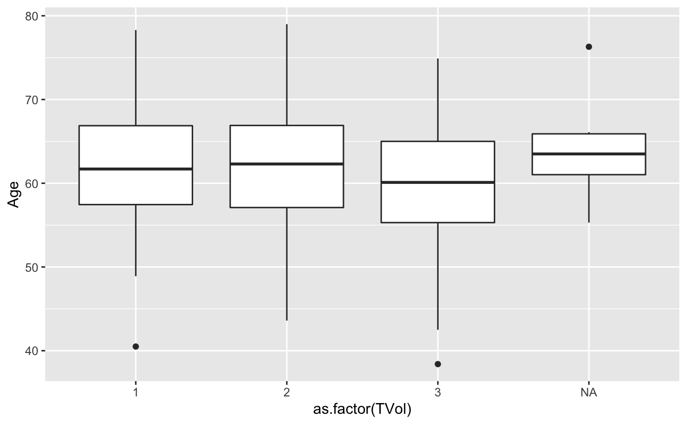
We can also use a violin plot, to better show the distribution of the dataset, instead of using a boxplot.
And we can also overlay a different geometry on top.
ggplot(blood) +
  geom_violin(aes(x = as.factor(TVol), y = Age)) +
  geom_point(aes(x = as.factor(TVol), y = Age))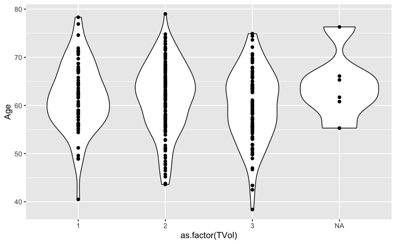
ggplot(blood) +
  geom_violin(aes(x = as.factor(TVol), y = Age)) +
  geom_jitter(aes(x = as.factor(TVol), y = Age))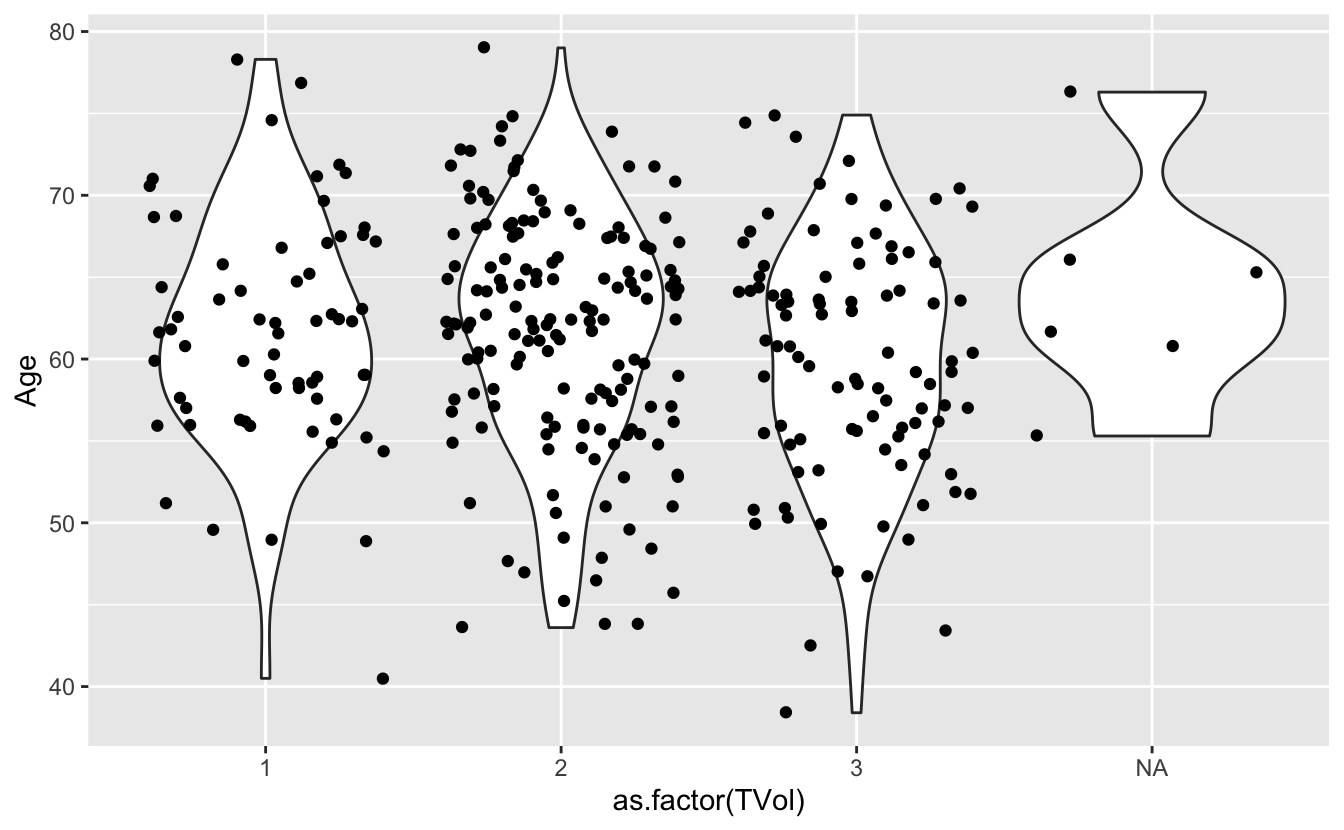
We can move around our data layers to save some typing, and have the geometry layer use the same data and mapping layer.
ggplot(blood, aes(x = as.factor(TVol), y = Age)) +
  geom_violin() +
  geom_jitter()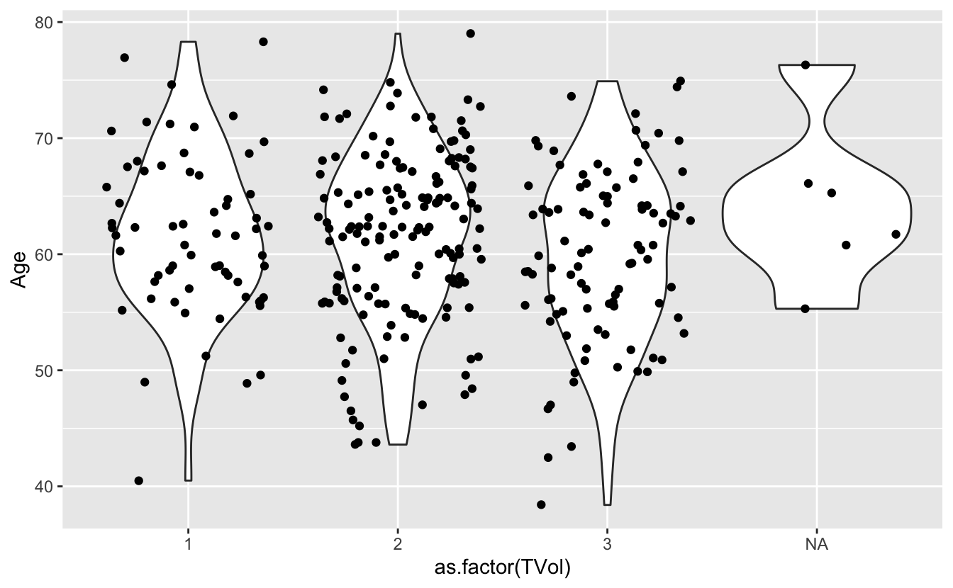
7.6 Other Astetic mappings
We can also set other asthetic mappings, e.g., color
PVol: Prostate volume in grams (g)PreopPSA: Preoperative prostate specification antigen (PSA) in ng/mLsGS: Surgical Gleason score- 1 = Not assigned
- 2 = No residual disease or score 0-6
- 3 = Score 7
- 4 = Score 8-10
ggplot(blood) +
  geom_point(aes(x = PVol, y = PreopPSA, color = sGS))
Warning: Removed 11 rows containing missing values (geom_point).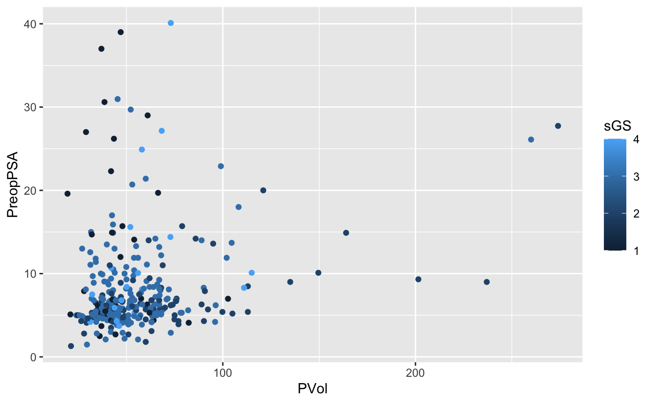
Again, we have a numeric variable that is really an ordinal categorical variable
ggplot(blood) +
  geom_point(aes(x = PVol, y = PreopPSA, color = as.factor(sGS)))
Warning: Removed 11 rows containing missing values (geom_point).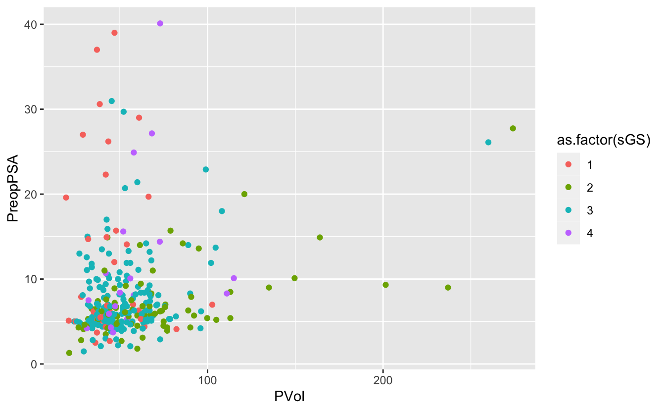
7.7 Facets
Facets allow us to re-plot the same figure by separate groups.
Think of this as the group_by version for plotting.
# use facet wrap for a single variable
ggplot(blood) +
  geom_point(aes(x = PVol, y = PreopPSA, color = as.factor(sGS))) +
  facet_wrap(~ RBC.Age.Group)
Warning: Removed 11 rows containing missing values (geom_point).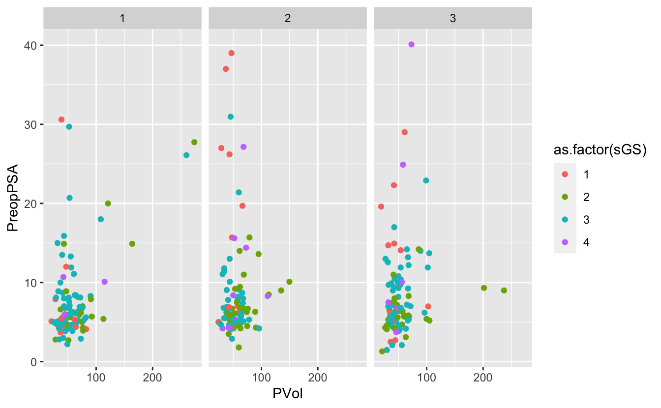
# use facet grid for 2 variables
ggplot(blood) +
  geom_point(aes(x = PVol, y = PreopPSA, color = as.factor(FamHx))) +
  facet_grid(RBC.Age.Group ~ Recurrence)
Warning: Removed 11 rows containing missing values (geom_point).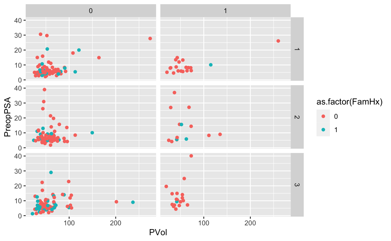
7.8 Themes
g <- ggplot(blood) +
  geom_point(aes(x = PVol, y = PreopPSA, color = as.factor(FamHx))) +
  facet_grid(RBC.Age.Group ~ Recurrence)
g
Warning: Removed 11 rows containing missing values (geom_point).
g + theme_minimal()Warning: Removed 11 rows containing missing values (geom_point).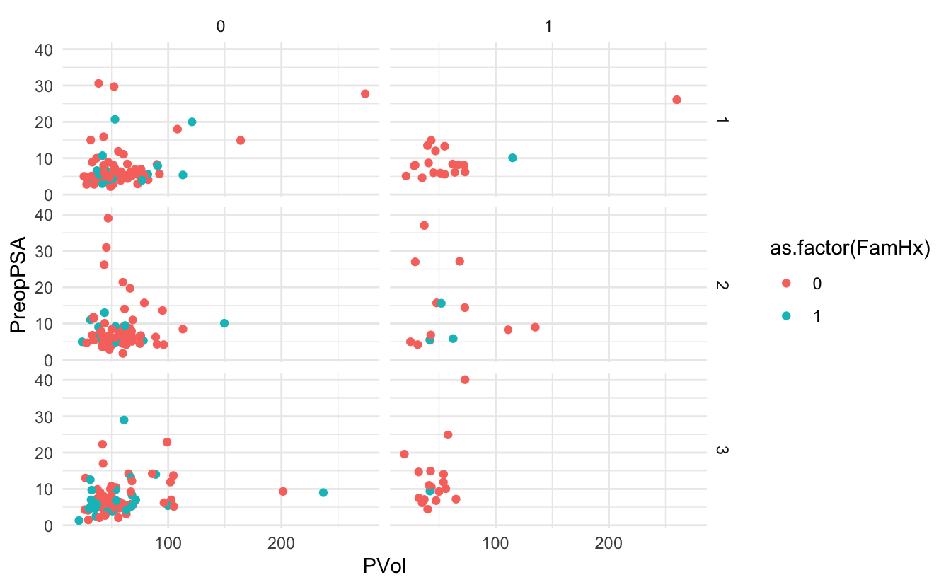
Using ggthemes
library(ggthemes)g + theme_wsj()Warning: Removed 11 rows containing missing values (geom_point).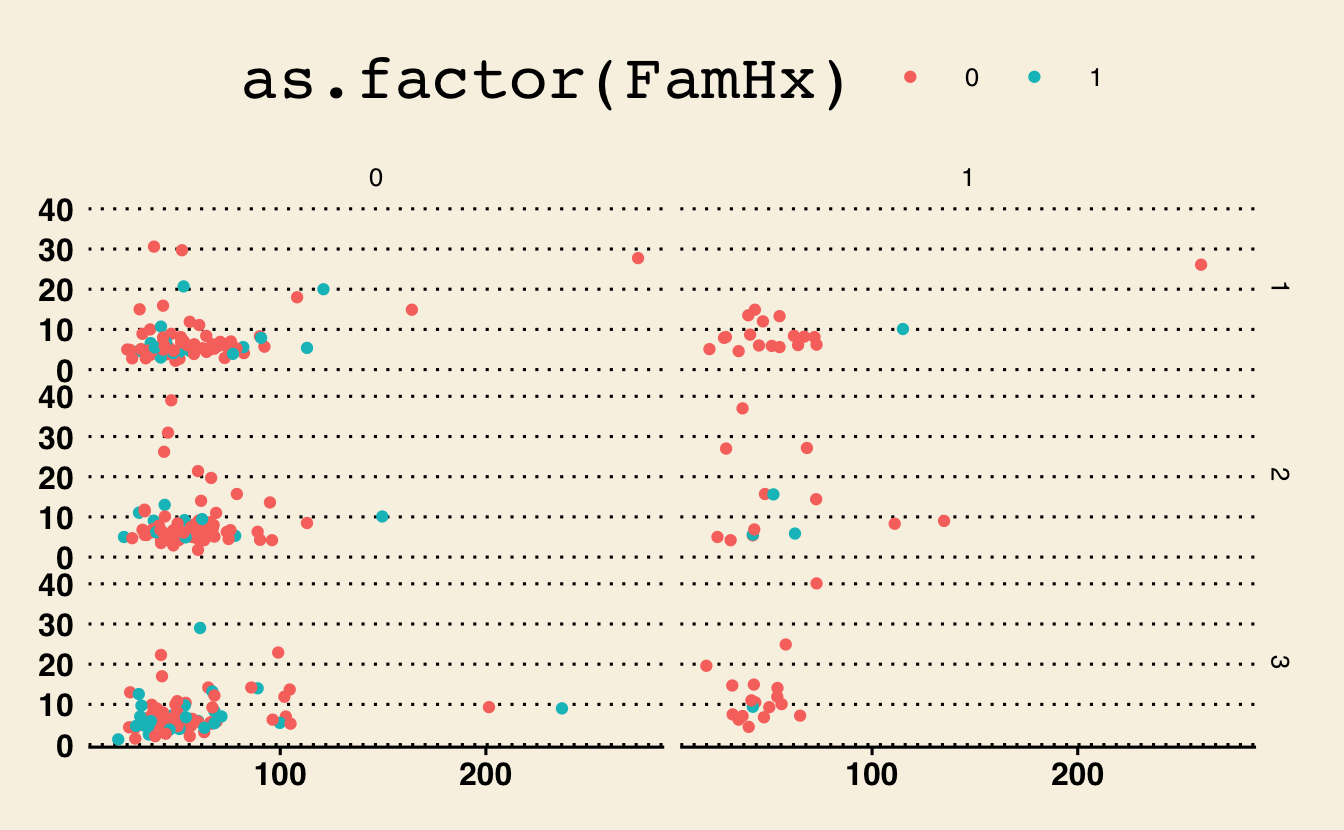
g + theme_fivethirtyeight()Warning: Removed 11 rows containing missing values (geom_point).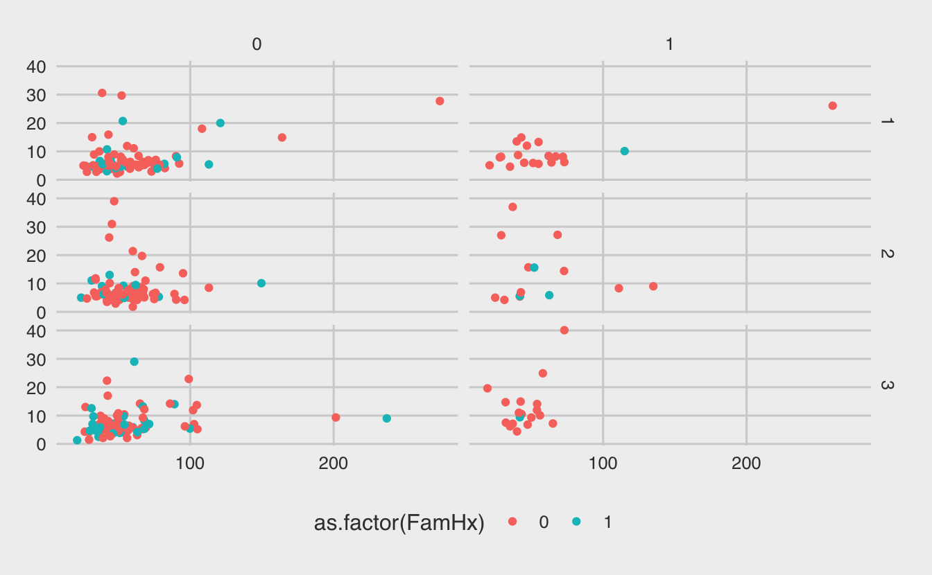
g + theme_excel()Warning: Removed 11 rows containing missing values (geom_point).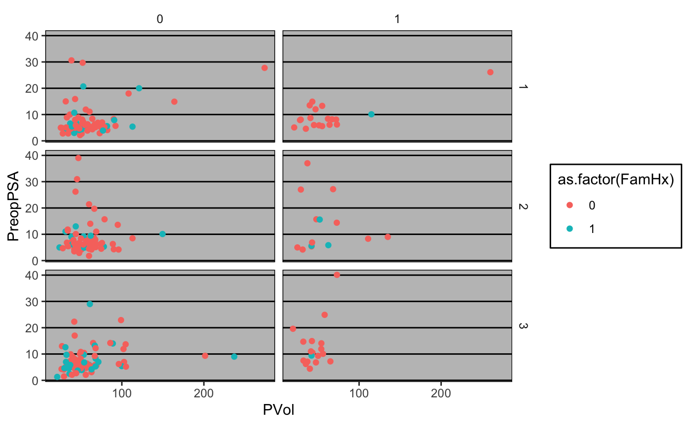
- Load the cytomegalovirus dataset, assign it to the variable
cmv
library(medicaldata)
___ <- cytomegalovirus- Bar chart of the
cmvresponse variable
ggplot(cmv) +
____(aes(x = ____))- bar plot of
prior.transplant, colored bycmvvalues
ggplot(____, aes(as.factor(____))) +
geom_bar(aes(fill = as.factor(____)))- facet by both
donor.cmvandrecipient.cmv
ggplot(cmv, aes(as.factor(prior.transplant))) +
  geom_bar(aes(fill = as.factor(cmv))) +
____(____ ~ ____)cmv <- medicaldata::cytomegalovirus
ggplot(cmv) +
geom_bar(aes(x = cmv))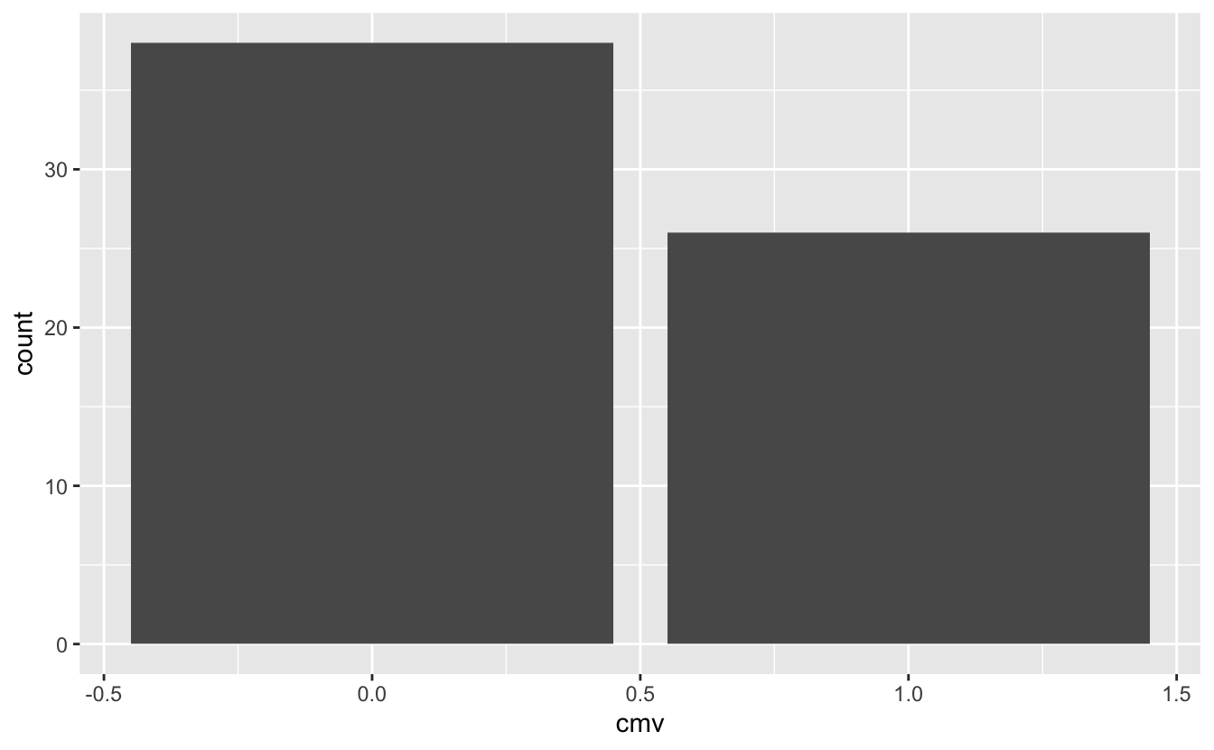
ggplot(cmv, aes(as.factor(prior.transplant))) +
  geom_bar(aes(fill = as.factor(cmv)))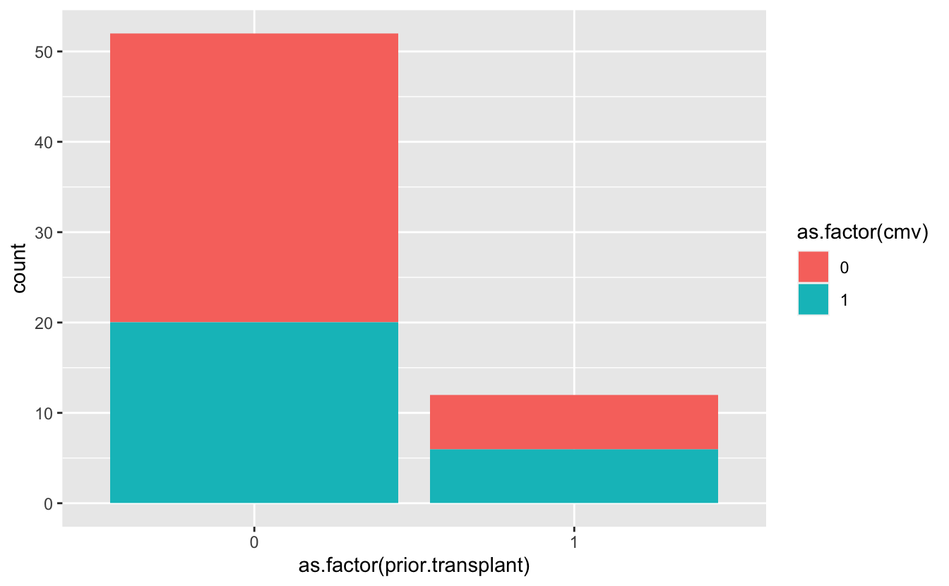
ggplot(cmv, aes(as.factor(prior.transplant))) +
  geom_bar(aes(fill = as.factor(cmv))) +
  facet_grid(donor.cmv ~ recipient.cmv)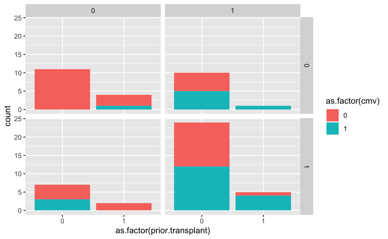
7.9 Additional Resources
- Ggplot2 reference
- R Graphics Cookbook
- 1st edition: http://www.cookbook-r.com/Graphs/
- 2nd edition: https://r-graphics.org/
- Thomas Lin Pedersen ggplot workshop